Same data, different stories: How to manipulate the graphs to support your narrative
Know that feeling when you're trying to create a narrative and support it with data, but data doesn't play along?
We’ve all been there, tweaking our graphs a little bit - stretching here, bending there… massaging the data to support our story and emphasize the trend... without lying of course.
Manipulative graphs are 100% accurate but misleading. They show true data but go through some “tweaking” to better support the story being told.
In this post, I’ll teach you the dark art of manipulating your graphs without losing too much credibility.
And if you’re on the receiving end, this post will help you spot dishonest graphs immediately, so nobody could fool you with those cheap tricks.
Spreadsheets and reports lovers - this post is for you!
Data trimming
They say trimming split ends can make your hair look healthier. It's the same with graphs.
For example, if your sales are slowing down, you can drop the most recent 1-2 months. If someone asks, you can always say you didn’t have the time to refresh the data.
Of course, if you see something like that, ask for the latest numbers. Good companies should be able to pull the data easily. If they don’t - they are either hiding something or just not as technical as they should be.
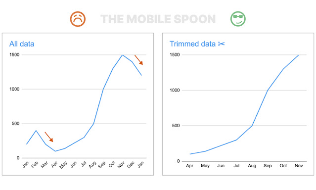 |
| And if they ask, just say the graph is a bit outdated... |
Changing the time resolution
Random peaks are bad for your trend line.
When a graph shows unsustainable peaks - changing the time resolution can flatten the volatility and create a more consistent trend line.
For example, if your startup ran into occasional hype, and you cannot sustain it - you might want to flatten it by increasing the time resolution from quarters to years:
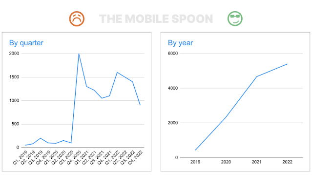 |
| Same data, different story |
Now, this example might seem extreme but it can happen, especially in low-scale startups operating in dynamic markets. Always remember:
Different time resolutions = different stories
And if you're reviewing a graph that seems to be slowing down a bit - consider it a red flag.
Ask to zoom in. Ask the hard questions until the truth is discovered.
Presenting cumulative data
So you're working on a kick-ass pitch deck, but your growth numbers are too depressing?
Cumulative data is the easiest trick in the book; you add successive inputs in the data model to ensure that the graph only goes in one direction - and that’s up.
A perfect way to make your sales numbers look better!
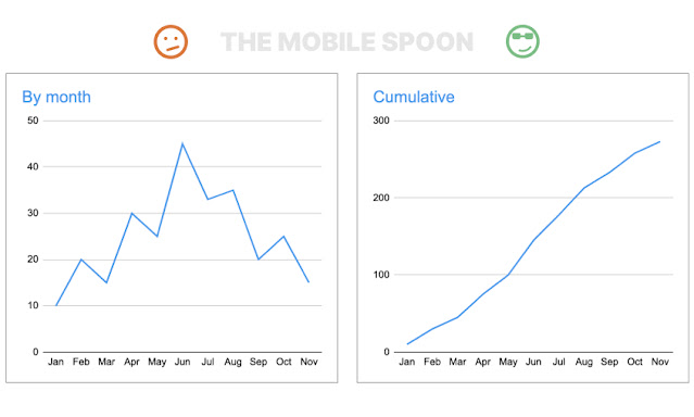 |
| Graph not going up? Switch to cumulative... |
Now, I know what you're thinking: “Who would be so stupid to use such a dumb trick?”
Well, how about mighty Apple?
Changing graph dimensions
If you’re looking for some intelligent tricks, this is not one of them… (but I promise there are some better ones down the list).
Your graph doesn’t look impressive enough? Stretch it up a bit - that will do it! 🤦🏻♂️
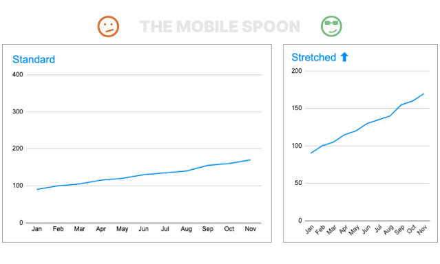 |
| Never trust the tall guys. They are always hiding something. |
Of course, if you just deep dive into the actual numbers you will notice the growth isn’t as impressive as it looks…
Check out these other guides:
- How to design data tables that don't suck - the 20 rules guide
- The all-in-one guide to high-converting CTA buttons
- How to handle the on-screen keyboard without messing up your app usability
Changing the baseline
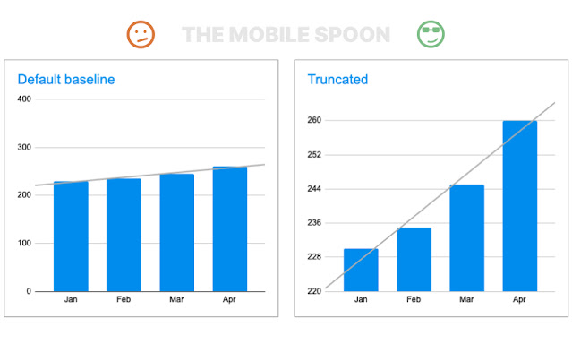
Trend is too weak? Change the baseline and witness the magic!
 |
| Trend is too weak? Change the baseline and witness the magic! |
This one is called a Torn Graph (or Truncated Graph) and it's hard to spot when done gently (no need to truncate the whole axis like I did in my illustration), so always make sure to look at the Y-Axis before diving into the trends.
OK, time to elevate this list with a touch of sophistication:
Event data vs cohort-based data
You all know the difference between cohort-based and event-based reporting, right?
Switching from cohort to event-based graphs can dramatically change the story, so you can use it to your advantage.
Let's take an example:
Imagine your early cohorts are performing pretty well, but over time, you notice that newer cohorts are showing lower numbers (where numbers can represent orders, revenue, engagement, or whatever you're measuring).
BTW, this is a known phenomenon where early adopters are often behaving differently than the majority of users.
Here's the data you're looking at:
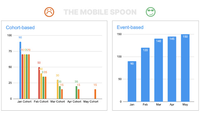
A cohort-based analysis will enveil that the numbers are decreasing: January's cohort started with 90, February's cohort started with 50, and April's cohort started with 20. That's a bad sign.
However, if you put this exact same data in an event-based graph, the numbers are still, somehow, going up, and that's due to the January cohort that demonstrates a high retention rate and keeps producing good numbers across months:
Of course, any experienced person will want to see a cohort-based graph.
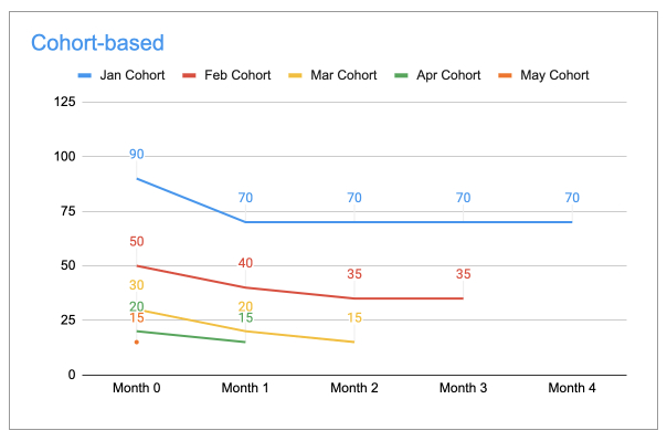
When you normalize those cohorts to start in "month 0", it's easy to see that each cohort starts at a lower bar. All the red flags are exposed in this graph:
The takeaway?
Cohort-based graphs can tell a different story than event-based graphs.
You can use this to your advantage, but keep in mind that experienced managers and investors will likely ask to delve into your cohorts, as cohort analysis is crucial for evaluating performance.
Here's a summary:
 |
| Cohort-based graphs tell a different story than event-based graphs |
And if you're really into cohorts and retention rates, check out my guide: Cohort analysis - 4 ways to analyze your product retention rate.
Using filters
For my next tweak, I'll refer to the difference between soft-activated and hard-activated users.
Soft-activated users are those who used your product once or twice but haven’t fully converted to “hard-activated” users, meaning, they tried it (maybe even paid for it), but didn’t turn it into their habit.
Different products have different definitions of hard vs. soft activated users.
For example, tourists using a scooter rental app might use it once or twice during their short vacation, and then they will stop, and not because something was wrong with the product.
Does it mean they churned? No, that means they were never real hard-activated users, they were "soft-activated" (more about it here).
Why is this important?
Because having a lot of soft-activated users will crush your retention graphs.
So why not exclude those bad users from your reports? They didn't belong there in the first place!
See how this horrifying 5% retention rate turns into a sexy 40% retention rate:
 |
| Filtering out bad users can make or break your graph |
Filtering out data from your charts might feel misleading or dishonest, but if you're transparent about it and do it consistently across all of your reports then it can work.
If you want to manipulate your reports, filter out bad users when it serves your narrative (like in this retention rate graphs), and include them in other reports such as top-line revenue graphs.
The enemy is sophisticated.
Ask questions about the cohorts, the dates, the filters, etc.
Switching from users to revenue (or vice versa)
Your graph doesn’t play along with your desired trend?
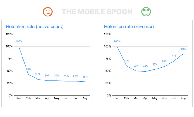
Try switching from revenue to users, from users to organizations, from organizations to actions, or back to revenue... 🤦🏻♂️
Exhaust all possibilities until you find the one that most effectively supports your narrative:
 |
| A 28% retention rate is OK, but 85% is waaaaay better! |
Here, again, you should decide how transparent you want to be.
I'm in favor of being 100% transparent and making the titles as informative as possible. It's legit to emphasize the most impressive graphs that support your narrative but keep in mind that experienced reviewers will know how to ask the right questions and what to look for, so any dishonesty will eventually be exposed.
- - -
That's it for this one, and if not - make sure to leave me a comment.
Before you drop off, make sure to subscribe to my occasional newsletter and become 23% more awesome than average.


Comments
I honestly thought this was a sarcastic parody.
if the narative is lying, manipulate the graph to go along IS lying too.
Absolutely ALL the techniques you mentionned here are plain lying.
Valuable tips for spotting when someone is not 100% honest with their reports.
Post a Comment