13 additional tips for improving your UX writing (with examples)


UX Writing tips - the mobile spoon


Here's a second guide for boosting your UX writing skills and improving your product's microcopy.

If you haven't read my first guide - make sure to check it out here


1. Bite-sized text blocks instead of lengthy sentences

There are always words to remove and ways to simplify your sentences. 

UX Writing tips - Bite-sized text blocks


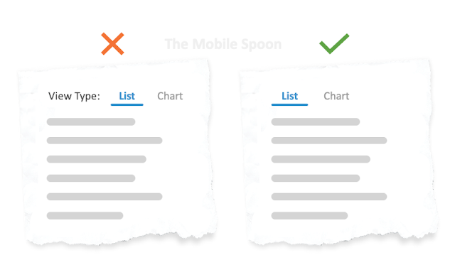
2. Less is usually better

You don't have to wrap every UI element with a descriptive text. 
Use common UI designs and users will find their way around. 

UX Writing tips - Less is usually better


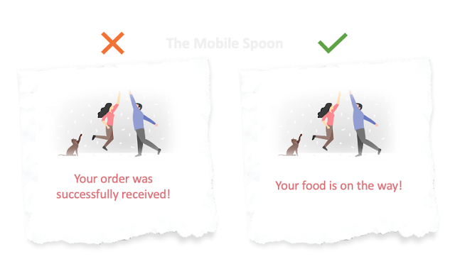
3. It’s not about YOUR product. It’s about THEIR benefits

Don’t describe what your product can do for them, explain what they (your users) can gain by using it.

UX Writing tips - It’s not about YOUR product. It’s about THEIR benefits


4. Play hard to get 

We all suffer from "the host syndrome" - that uncontrollable urge to promote every feature in our product so people realize how great it is.

Only problem is, nobody cares. 

Users are suspicious and impatient. An excess of data will overwhelm them and turn them off. 
So instead of bloating your product with too much information, use progressive disclosure: start simple, and add complexity as the users become more experienced and engaged. 
This approach should be applied to both features and UX Writing.


5. Use familiar terminology

Do not reinvent the wheel, or else your users will feel lost, or just find it unprofessional. 

Also, avoid technical jargon. 
Your writing should fit everyone and not everyone is as technical as yourself.


6. Be consistent

  • Confirm your email? Or is it "verify" your email? Approve? Authorize? 
  • "Remove" item or "Delete" item? 
  • Is it "Edit" or "Update"?
Whatever you decide, be consistent with it across your product and any other communication (email/push notifications) with your users. 


7. Use simple examples to reinforce your message

Avoid formalities and speak to your users in a way they can easily understand. 
Include examples that can help everyone understand your point. 

UX Writing tips - Use simple examples to reinforce your message


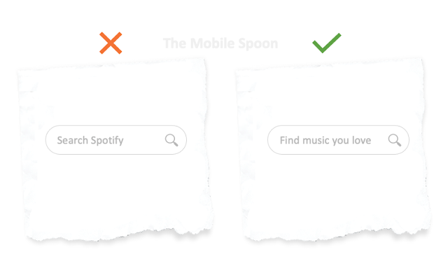
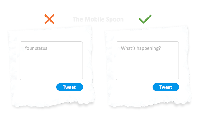
8. Be conversational

Embrace a casual and friendly tone: 

UX Writing tips - Be conversational


But please don't take it to the extreme:

UX Writing tips - Be conversational, but don't exaggerate


9. User plain language 

Writing in plain language makes your content easier to read, easier to understand, and more accessible.
Here's a handy list of human-friendly words to help you replace that robotic tone with a natural one. 


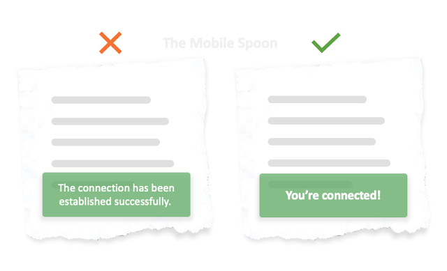
10. Use present tense and active voice

Write short and direct sentences to describe actions and create a sense of immediacy. 
This will keep your users engaged. 

  • Instead of: "The Search button should be used to find your article"
  • Use: "Click Search to find your article".
  • Instead of: "Message has been sent"
  • Use: "Message sent".

UX Writing tips - Use present tense and active voice


11. Remember: fewer risks = fewer drops

Hesitant users are more likely to drop off.
Use microcopy to increase trust and eliminate security and privacy concerns. 


UX Writing tips - fewer risks = fewer drops

Here’s a complete list of CTA button decorators designed to increase conversion rates. 

And here's my crazy collection of 84 cognitive biases to help you better understand your users and optimize your product and writing accordingly. 


12. Set the right expectations

As mentioned in my post 10 lessons learned from asking our users to pay - sometimes the smallest clarification can set the right expectations and boost conversion rates dramatically. 

UX Writing tips - Set the right expectations


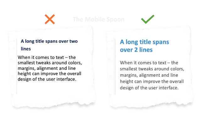
13. Text is a significant part of your design

And as such - it is important to pay attention to how it blends within the overall look & feel. 

  • Alignment & margins
  • Font size
  • Color
  • Capital letters
  • Spacing and line-height
  • Number of lines
  • Dates and number formats
UX Writing tips - Text is a significant part of your design

For a full list of tips - check out my 40 rules guide about designing text in products.


That's it for this one, hope you found it useful and informative. 

Before you head off. make sure to subscribe to my occasional newsletter and become 23% more awesome than average. 


Comments

Gil Bouhnick The Mobile Spoon
Amir said…
The easiest tip in UX writing is to get rid of 80% of the words.
Gil Bouhnick The Mobile Spoon
John Anderson said…
It is an informative post.
Gil Bouhnick The Mobile Spoon
Anonymous said…
Great tips! Thanks for sharing
Gil Bouhnick The Mobile Spoon
Sgn7 said…
Useful tips thtat seem easy to apply